

If you have spent any time scrolling Instagram lately, you have probably noticed something: carousels are everywhere, and the good ones stop you mid-scroll. A well-built carousel or infographic does something a single photo rarely can. It teaches, it organizes information, and it gives people a reason to swipe, save, and eventually share. For brands and creators trying to grow an audience organically, mastering this format is no longer optional. It is one of the highest-leverage content types on the platform right now.
This guide breaks down exactly how to build carousels and infographics that people actually want to save and pass along, from the psychology behind why they work to the practical design steps that separate a scroll-stopper from something that gets ignored.
Why Carousels and Infographics Outperform Single Posts
Instagram's algorithm rewards content that keeps people on the app longer, and carousels are built for exactly that. Every swipe counts as an interaction, and dwell time on multi-slide posts tends to be significantly higher than on static images. That extra time signals to the algorithm that your content is valuable, which often translates into wider distribution.
There is also a psychological layer at play. Carousels break information into digestible chunks, which lowers the mental effort needed to consume a topic that might otherwise feel overwhelming as a wall of text. Infographics take this a step further by turning raw data or a process into a visual story the eye can follow without much thinking. People do not just consume this kind of content, they file it away for later, which is why carousels and infographics tend to earn disproportionately high save rates compared to reels or single photos.
Saves matter more than most creators realize. A save tells Instagram that someone found the content valuable enough to want to return to it, and that signal carries real weight in how far a post travels. Shares carry similar weight, since they extend your content into new networks you would not otherwise reach organically.
Start With a Problem, Not a Design Template
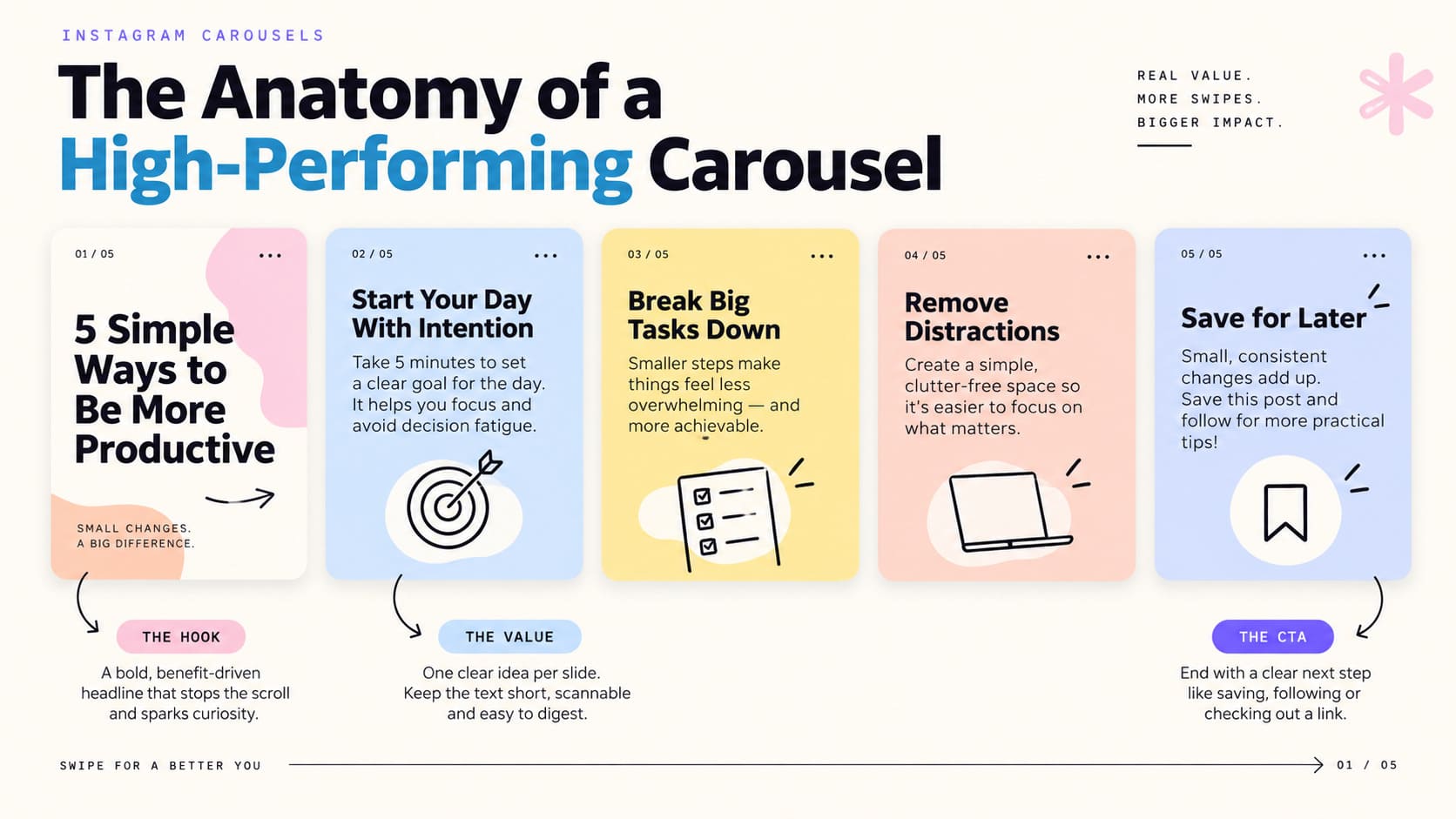
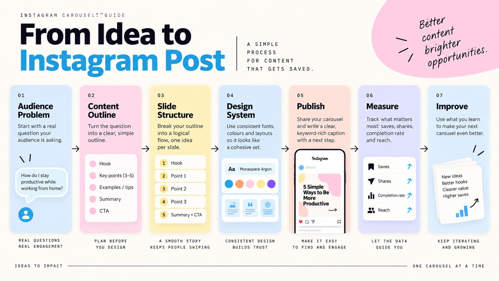
The biggest mistake people make when building a carousel is opening a design tool first and figuring out the content later. That approach almost always produces something that looks fine but says very little. Instead, start with a single question your audience is actually asking, and build the carousel as the answer.
Think about the format like a mini article broken into slides. Slide one is your headline. It needs to state a clear benefit or spark curiosity within about two seconds, since that is roughly how long you have before someone decides whether to keep swiping. The middle slides deliver on the promise, one idea per slide, without cramming multiple concepts into a single frame. The final slide should either summarize the takeaway or prompt an action, like following for more tips or saving the post for later.
This structure works because it mirrors how people actually process information. Nobody wants to work hard to understand your content, so the fewer decisions and less scrolling back and forth they have to do, the better your completion rate will be.
Designing for the Swipe, Not the Scroll
Carousels live or die on their first slide. If it does not earn the swipe, nothing else in the post matters, no matter how good the information inside is. A strong opening slide typically includes a bold, high-contrast headline, minimal supporting text, and a visual hook, whether that is a striking color, an intriguing image, or a number that grabs attention.
From there, consistency becomes the priority. Every slide should share the same fonts, color palette, and layout grid so the carousel feels like one cohesive piece rather than a patchwork of mismatched slides. This is where a lot of accounts lose credibility. Inconsistent design reads as unpolished, even when the information itself is solid.
A few practical design habits make a noticeable difference:
- Keep text large enough to read on a phone screen without zooming in, generally no smaller than 24pt for body copy.
- Limit each slide to one core idea and no more than two or three short lines of text.
- Use directional cues, like arrows or partially cut-off text at the slide edge, to visually nudge people toward swiping.
- Leave breathing room. Cramped slides feel exhausting to read, while generous white space makes information feel easier to absorb.
- End on a slide that gives people a clear next step, whether that is following the account, visiting a link in bio, or saving the post.
Turning Data Into an Infographic People Trust
Infographics carry a different kind of weight than a typical carousel because they are often presenting facts, statistics, or a process. That means accuracy and clarity matter even more. Before touching a design tool, organize your data into a simple narrative arc: what is the situation, what does the data show, and what should the viewer take away from it.
Charts and icons should support the data, not decorate it. A common mistake is choosing a flashy chart style that actually makes the numbers harder to interpret. Simple bar charts, line graphs, and icon-based comparisons tend to outperform overly stylized graphics because they respect the viewer's time. If a chart takes more than a couple of seconds to understand, it needs to be simplified.
Sourcing matters too. Citing where your data comes from, even briefly in small text at the bottom of a slide, builds trust and makes the content feel more credible and shareable. People are far more likely to pass along something that feels authoritative rather than something that looks like an unverified claim.
Building a System, Not a One-Off Post
Accounts that consistently produce high-performing carousels rarely start from scratch every time. They build a repeatable system: a template with pre-set fonts, colors, and layout structures that can be reused and refreshed with new content. This does two things. It speeds up production significantly, and it reinforces brand recognition, since a familiar visual style helps followers instantly recognize your content in their feed before they even read a word.
Tools like Canva, Figma, and Adobe Express all support reusable templates, and building a small library of five or six slide layouts covering different content types, like lists, comparisons, and step-by-step guides, can cover most of what you will need long term.
It also helps to batch-produce carousels around a content calendar rather than creating them reactively. Planning topics a few weeks ahead means you can research more thoroughly, gather better data for infographics, and avoid the rushed, thin content that tends to underperform.
Writing Captions That Extend the Carousel's Reach
The caption underneath a carousel is not just an afterthought. It plays a real role in whether the post gets discovered in the first place. A strong caption expands on the slides without repeating them word for word, adds context, and includes a natural call to action that encourages saving or sharing. Something as simple as asking people to save the post for later, or tag a friend who needs to see it, can meaningfully lift engagement.
Keywords in the caption also help with discoverability, since Instagram's search has become increasingly text-based. If your carousel is about morning routines, working relevant phrases naturally into the caption gives the post a better chance of surfacing in search results, not just the algorithmic feed.
Distribution: Getting the First Wave of Engagement
Even the best-designed carousel will underperform if it does not get an initial push of engagement, since Instagram tends to test content with a small audience segment before deciding whether to distribute it further. Posting at a time when your audience is actually active, encouraging your existing followers to engage early, and cross-posting to Stories with a swipe-up prompt back to the post can all help build that early momentum.
This is also where a strong follower base becomes genuinely useful, not just as a vanity metric but as functional distribution infrastructure. A larger, more active audience means more people see your carousel in the first hour, which directly influences how far the algorithm decides to push it afterward. Accounts that have invested in building a real, engaged following through services like the growth support offered at https://soldoutx.com/buy-instagram-shares tend to see that early engagement compound faster, since there are simply more eyes on the post from the moment it publishes.
Common Mistakes That Kill Save Rates
A few recurring issues show up again and again in underperforming carousels. Overloading slides with too much text is the most common one. If a slide needs more than a few seconds to read, most people will swipe past without absorbing it. Inconsistent branding across slides is another, since it makes a post feel unfinished even when the content itself is strong.
Weak hooks are a quieter killer. Many creators put their best information in the middle of the carousel instead of the first slide, which means most people never see it because they never swiped past slide one. Similarly, ending a carousel without any call to action wastes the momentum you have built. Someone who just spent ten seconds reading through your content is primed to take an action, and not asking for one is a missed opportunity.
Finally, ignoring performance data is a mistake that compounds over time. Reviewing which carousels earned the most saves and shares, and identifying what those posts had in common, whether it was topic, format, or hook style, gives you a feedback loop that makes every future post slightly better than the last.
Measuring What Actually Matters
Likes are the least useful metric for carousels and infographics. Saves, shares, and completion rate (how many people swipe all the way through) tell a much more accurate story about whether your content is genuinely resonating. Instagram Insights provides this data for business and creator accounts, and it is worth reviewing regularly rather than only glancing at it occasionally.
A useful benchmark to track over time is your save rate relative to reach, since a high save rate typically signals content that people consider genuinely useful rather than just entertaining in the moment. Posts with strong save rates also tend to get resurfaced by the algorithm days or even weeks later, giving them a longer shelf life than typical feed content.
Choosing the Right Topics in the First Place
Even the most polished design cannot rescue a topic nobody cares about, so topic selection deserves as much attention as the visual execution. The strongest carousel topics tend to fall into a few reliable categories: step-by-step tutorials, myth versus fact breakdowns, before-and-after comparisons, and curated lists of tools, ideas, or resources. These formats work because they promise a clear, bounded payoff, and people can tell from the first slide roughly how much value they are about to get.
A useful exercise is to look through your own comments, DMs, and saved posts from other accounts in your niche to spot recurring questions. If three different followers have asked some version of the same question in the last month, that is a strong signal the topic deserves a full carousel rather than a quick reply. Competitor research helps too. Looking at what similar accounts have published, and specifically which of their posts earned unusually high saves relative to their average, often reveals patterns worth borrowing and improving on rather than copying outright.
It also helps to think in terms of evergreen versus timely content. Evergreen carousels, like foundational how-to guides, tend to keep earning saves and shares months after publishing, which makes them worth the extra polish. Timely carousels tied to a trend or seasonal moment can spike quickly but usually fade fast, so they are better suited to lower-effort production.
Adapting the Format Across Platforms
While carousels started as an Instagram-native format, the same principles now apply almost identically on LinkedIn, and with some adjustment, on Pinterest and even TikTok's photo mode. LinkedIn audiences respond particularly well to carousels that break down frameworks, career advice, or industry data, though the tone typically needs to be more direct and less visually flashy than what works on Instagram.
Repurposing a single well-researched carousel across two or three platforms is one of the most efficient ways to stretch the value of the research and design time that went into it. The core slides can usually stay close to identical, with only the caption and a few platform-specific tweaks, like aspect ratio or slide count, needing adjustment. This is especially worth doing for infographics built around original data or research, since that kind of content tends to have a long shelf life and can keep attracting shares long after the initial posting window has passed.
Working With Designers or AI Tools Efficiently
Not every account has an in-house designer, and that is fine. A clear content brief matters more than raw design talent when it comes to producing carousels that actually perform. A good brief includes the core message per slide, any data or sources that need to be included, the tone you are going for, and a couple of reference posts, either from your own account or a competitor's, that capture the visual direction you want.
AI-assisted design tools have made it easier than ever to go from a rough outline to a polished carousel without much manual layout work, but they still need clear direction to avoid producing generic-looking output. Feeding a tool a strong content outline, rather than a vague prompt like "make an infographic about productivity," tends to produce far better first drafts and cuts down significantly on revision rounds.
Whether you are working with a freelancer, an in-house designer, or an AI tool, building a simple style guide, covering approved colors, fonts, and layout rules, pays for itself quickly. It keeps every carousel looking like it belongs to the same account, even when different people or tools are involved in producing it.

Bringing It All Together
Building shareable carousels and infographics comes down to a fairly simple formula, even if executing it well takes practice. Start with a real question your audience wants answered, structure the content so each slide carries its own weight, keep the design clean and consistent, and give people a clear reason to save or share what they just saw. Layer in a repeatable system so you are not reinventing the format every time, and pay attention to what your own data tells you about what is working.
None of this happens in isolation, though. Great content still needs an audience large and active enough to give it that crucial first push, which is why so many creators pair a strong content strategy with genuine follower and engagement growth to make sure their best work actually gets seen.
If you found this article helpful, you might also enjoy these related posts. They cover similar topics, answer common questions, and offer additional ideas to help you get the most out of your journey.